top of page
NEXT App
Payment Redesign
Reduced driver’s payment time from 12 days to 3 days


Context
NEXT Empowers drivers to secure jobs and support their families through a dedicated marketplace.
Despite being a traditional industry, truck drivers currently rely on paper documents as proof of work to ensure timely payment.
Team
Senior Product Designer (me)
PMs (across teams)
6 Engineers
PMM
Time
5 sprints (10 weeks)
Launch
Version 2.4.19 - May 2022
Version 2.5.0 - June 202

The Problem

Drivers didn’t get paid on time
Despite NEXT offering a Quick Pay feature promising payments within 3-5 business days, the average payment processing time for drivers extended to 7-12 days, resulting in a significant influx of complaints, and a 0.2 drop of app rating.
Losing customers
Due to the declined credibility, some clients have expressed reservations about collaborating with our organization. Regrettably, we have experienced a shortfall in securing several contracts valued in the millions of dollars.
Design Process

Understand
To comprehend the origins of this issue, an initial phase of internal investigation was undertaken involving our pertinent stakeholders. This inquiry revealed that adherence to specific prerequisites is essential for expediting payment within a 3-5 day window:
-
Complete submission of all mandated documents and invoices is imperative.
-
Provision of supplementary documents is requisite should they be applicable.
-
The process entails the obligatory step of document validation and approval.
Persona


Upon undertaking proactive user research, I discerned that certain edge cases have not been comprehensively addressed. Consequently, our drivers are experiencing confusion or overlooking certain interactions.
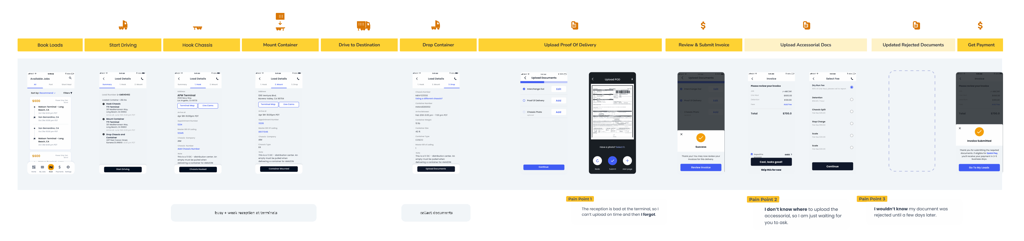
User Journey
Following a thorough analysis of the present flow, I have formulated an alternative user journey aimed at mitigating user concerns. This involves the resequencing of steps and a revision of pivotal screens.
Define
Upon the departure of our Product Manager during the project, I took ownership of the product. Subsequently, I engaged with cross-functional stakeholders to collaboratively determine feature prioritization, considering both business imperatives and technical limitations.

Ideation
High-fidelity prototypes
I initiated the process with concepts involving new components. This would grant users the ability to promptly access pivotal features and pathways, eliminating the necessity to await the final step within the flow.


I
Revised Design - Stakeholders Review

A carousel layout for the cards can efficiently conserve space when accommodating additional tasks.

Introduce a new design component for the purpose of differentiating between mandatory and discretionary choices.
Revised Visual Design - Peer Designer Review


After reviewing with other designers, I have modified the visual design to enhance the visual hierarchy, thereby directing focus towards the essential documents.
Revised Visual Design - Final Executives Review
Following discussions with executives and stakeholders, I conducted copy revisions and reorganized the cards in accordance with business requirements.


Handoff


Results & Insights
Data - Success

1. 92.3% users upload all the documents within 5 minutes.
2. 40% users upload documents through dashboard reminder.
Data - Improvement Required

Only 30% users engage the card to upload documents before job is completed.

An important message was obscured by the card placed above it.
Research & Iteration
Immervise User Interview
Following discussions with executives and stakeholders, I conducted an immersive user interview to drive along with a driver, and invite a focus group to do card sorting in order to optimize the detailed information.


Iteration

Impact
User experience ⬆️

Customer Trust ⬆️
A few months subsequent to the introduction of the new features, owing to the restoration of our reputation, we secured one of our most significant clients, consequently facilitating the influx of 30,000 loads into our marketplace.

Reflections
Refrain from depending on written text to convey crucial messages.
1. Don't expect users to read
2. Data is the best teacher
Avoid interpreting user comments too literally; instead, ensure that design decisions are consistently substantiated through data analysis.
bottom of page